• apple,  ios 15,  iphone 13,  review

    iPhone 13 Pro Max Real-World Usage Impressions

    iPhone 13 Pro Max, Source: Apple, Inc.

    It has been a month since I got my iPhone 13 issues resolved and about a month and a half ago since the iPhone 13 family launched. As you might recall, I had a rough go of it for the first couple of weeks. A corrupted iCloud backup and a bad Face ID senor array can do that. Now that I have everything reconfigured and back to normal and I have had a chance to really live with my iPhone 13 Pro Max, I wanted to give you my opinions on this year’s largest flagship smartphone.

    The Hardware

    Year-over-year, iPhone 13 Pro Max looks and feels just like last year’s iPhone 12 Pro Max. That’s not a knock on the Apple industrial design. I love the iPhone 4/iPhone 5 style flat sides. In my opinion, I feel that I can get a better grip on iPhone 13 Pro Max than I could on my iPhone X-series and iPhone 11 Pro. I used to send those iPhones flying off the table trying to grab them. That has not been true with iPhone 13 Pro Max. I can get a firm grasp on it with the flat edges. Looking ahead, I’m relieved to hear that early iPhone rumors for the 2022 iPhone will keep the flat sides.

    This year’s iPhone 13 Pro Max includes a new 120Hz ProMotion adaptive refresh screen. This feature debuted with the 2017 10.5-inch iPad Pro and has taken until now to come to iPhone. When I got my iPad Pro, the ProMotion screen was really noticeable. Everything on that iPad Pro seemed buttery smooth. On iPhone 13 Pro Max, for me, the change is less noticeable. Maybe that’s because both my work and personal iPad Pro tablets, that I use all the time, already have ProMotion and my eyes are used to it.

    One area where the variable refresh rate of the display and the new A15 Bionic CPU shine is in its battery efficiency. The battery savings and my personal device runtime is incredible. As a light user of iPhone, I can get days out of a single charge. Your milage will obviously vary. For me, I have an iPad nearby when I’m home, that is my go-to device. If I want to do work, I turn to my iMac. But, when I’m on the go, my iPhone is front and center. While traveling, I listen to a lot of podcasts or music. Both of which are downloaded locally to my iPhone. I’m only streaming music from my iCloud Match or Apple Music subscriptions about 25% of the time. And activity that is done with the screen off. If I’m driving, my iPhone is connected to a Lightning adapter for CarPlay and will charge on my short commute to and from work. As a result of my limited use of iPhone with the screen on, I can easily get two days of use out of a single charge.

    Call me crazy, but when I got my first smartphone, a Palm Treo 600, Verizon charged a lot of money for a small amount of cellular data. Battery life wasn’t great back then, either. I learned to avoid suffering cellular data overage fees and have enough battery to make it through a day, needed to hoard battery and limit cellular data usage. It’s 2021. I need to learn to live a little. iPhone 13 Pro Max has tons of battery and ‘unlimited’ cellular plans are flat rate.

    All of this to say that I am really pleased with the new ProMotion display and all of the battery saving features of the A15. Rest assured that when it’s needed, the A15 CPU and ProMotion will deliver the goods.

    I should also mention that current 5G cellular modem and antennas on the Pro Max are good. I notice that I am getting more 5G service in more places that I go with better download speeds. I’m sure that this improvement is also to T-Mobile rolling out improvements to their network. (Yes, I get it. 5G got real and that Sprint is now a part of T-Mobile. Verizon and T-Mobile, you guys are the plumbing. Just serve up data quickly and reliably and I’ll be happy.)

    Source: Apple, Inc.

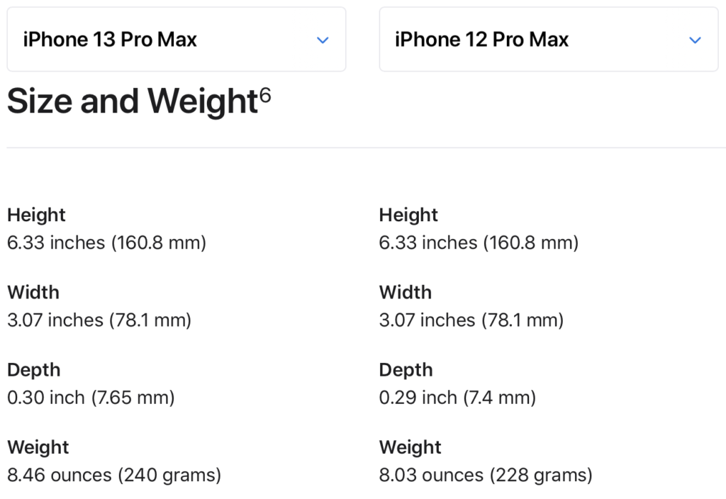
    According to the Apple iPhone specifications comparison page, the differences between this year’s Pro Max and last year’s Pro Max are almost identical in size and weight. The iPhone 13 Pro Max is 0.1 inch and 43 ounces thicker and heavier. In a Pepsi Challenge taste test of sorts, where my wife handed me both iPhones Pro Max with my eyes closed, I could not distinguish between the two iPhones. Until I felt for the camera bump, which is even more of a camera plateau than last year.

    Now that I’m living with iPhone 13 Pro Max as my everyday iPhone, I’m really not happy with the color options on the ‘Pro’ iPhones. My favorite color is blue, more specifically, a deep navy blue (aka Grassia Standard Blue). Last year’s Sierra Blue on the iPhone 12 Pro Max was close to that. Sierra Blue, is a much lighter blue than Sierra Blue. In my opinion, to my eyes in most of the lighting conditions that I find myself in at home or in the office, Sierra Blue looks more like battleship grey. I’m disappointed about that. Holding my iPhone 13 Pro Max up to the screen on my iMac with the Compare iPhone Models page, I feel that the on-screen Sierra Blue is more ‘blue’ than the phone I’m holding in my hand. If I wanted a grey iPhone, I would have opted for this year’s ‘black’ color, which is called Graphite. Graphite, in my opinion, is a better color in the hand than Sierra Blue is. Looking ahead, unless I am really blown away by the color choices for the 2022 iPhone line up, I think I will go with a Silver / Starlight / White color. I have a love/hate relationship with the 2021 Apple Leather Case selection this year too, but more on that later.

    The Camera System

    Access Photographic Styles by tapping the three-frame box just above the Shutter button in the iOS 15 Camera app.

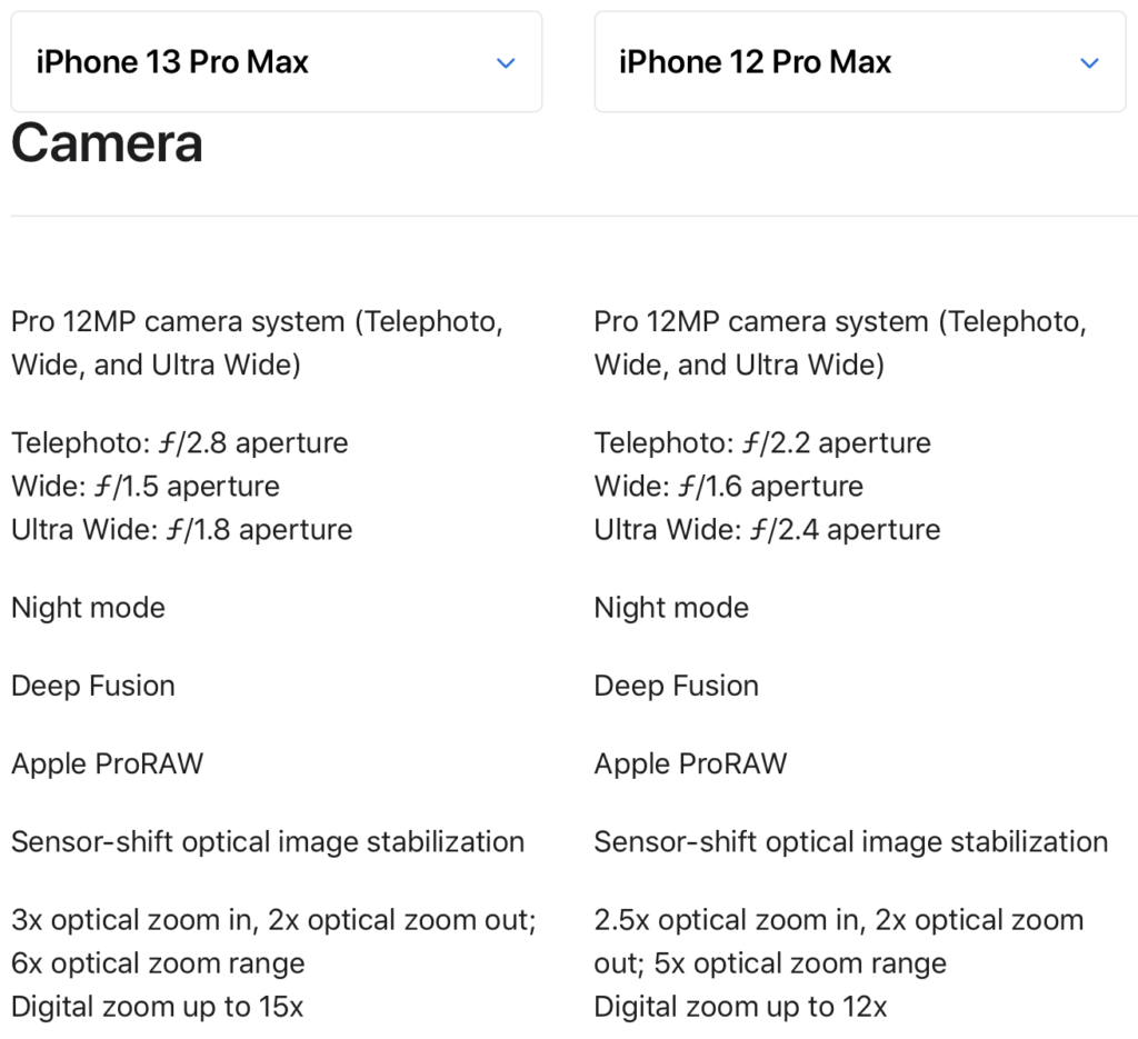
    iPhone 13 Pro Max has larger camera lens that require a larger over all surface area on the back of the phone. Referring back to the comparison page, you can see that the aperture values have changed between last year’s iPhones. I’m not a camera buff, so I really didn’t know if a higher or lower number is better or not. I found Christopher Crawford’s aperture tutorial to be helpful here. Basically, a camera’s aperture helps control focus on the subject. Depth of field relates the distance away from the camera lens that the subject is and at what point the back ground and foreground are in focus relative to the subject. The more you know, the better pictures you can take. For me, I have moved to the iPhone as my primary camera for taking pictures. To my untrained eye, iPhone 13 Pro Max photos taken in good lighting look fantastic. In worse lighting, or low lighting, your experiences will vary depending on how skilled of a photographer you are.

    I prefer the extra color saturation in the Rich Contrast Photographic Style. At least until I change my mind.

    Using what I learned on Crowford’s site, the iPhone 13 Pro Max’s wide and ultra wide cameras have gotten slight improvements in aperture, decreasing to f/1.5 and f/1.8 from f/1.6 and f/2.4, respectively. The telephoto lens on iPhone 13 Pro Max, technically, has a higher aperture rating of f/2.8 over the f/2.2 rating on the iPhone 12 Pro Max. However, iPhone 13 Pro Max has a telephoto optical zoom rating of 3x where as iPhone 12 Pro Max has an optical zoom rating of 2.5. In some test photos taken on a sunny day at the local sea wall or pumpkin picking on an overcast day, I felt the photos looked good to my untrained eye.

    Source: Apple, Inc.

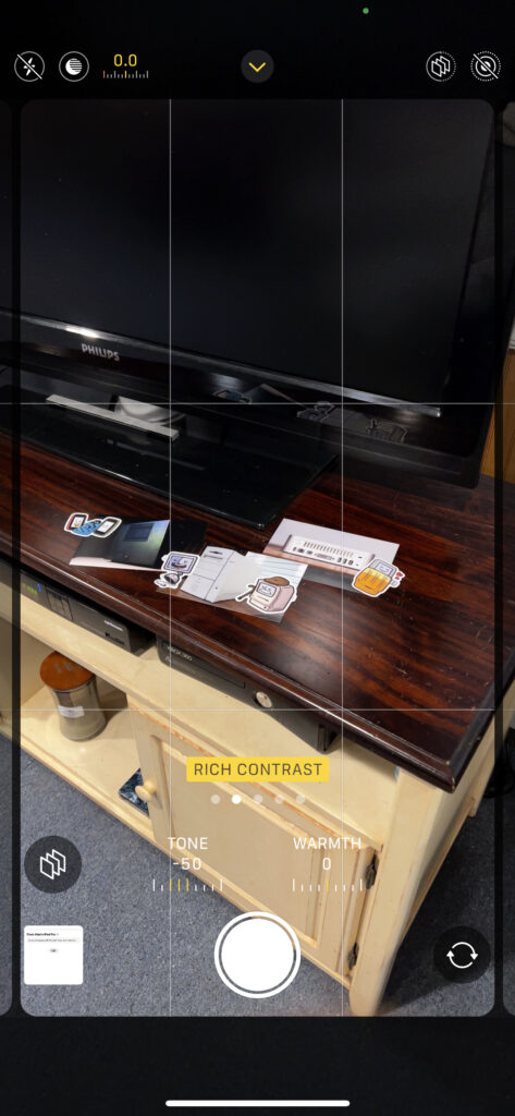
    One noticeable improvement in this year’s iPhone Pro Max is the inclusion of Photographic Styles. I have been an iPhone photo “purist” in that I don’t generally tweak photos aside from cropping and the use of the automatic enhancement tool. Photos taken of the kids at the farm while picking pumpkins, I felt, looked better in the Rich Contrast setting. In this mode, photos taking with iPhone have a Tone value of -50 and a Warmth value of 0. These values cannot be changed once the photo is taken. They are in effect “burned” into the photo, relative to the Standard Apple photographic style. In my opinion, the extra color saturation looks better and leans toward the higher saturation styles that are default on Android smartphones.

    iOS 15

    In my daily use of iOS 15, I don’t feel like there are many major improvements in how I use my iPhone. There are lots of quality-of-life improvements over iOS 14 that I do appreciate. I prefer iOS over Android for its fit and finish, but I say for the security features. While still in beta, I have found that the new iCloud Private Relay feature works well. As the name implies, information sent from Safari is relayed to two different secure servers. The first relay is data sent from Safari on your iPhone through your network provider and on to the secure servers run by Apple. In this first ‘hop’, Apple and your service provider and Apple know your IP address, which is a unique identifier, however, DNS traffic is encrypted so that neither Apple nor your service provider know which website was requested. The second ‘hop’, takes the encrypted DNS information, decrypts it, generates a random IP address, and then forwards the request on to the web server of the site you are trying to visit. This feature isn’t exactly like a VPN service, but it does help mask who is requesting what website information. If you squint, it sure feels to me, like iCloud Private Relay is setting the foundation for an eventual iCloud or Apple One VPN service. Which brings me to the thing that I don’t like about Private Relay. You have to pay to get this feature, even though it’s baked into iOS 15. Blame Tim Cook’s relentless push into services and the drive to extra even more ‘value’ (read: revenue) from Apple’s customers. On the positive side, any subscription to an iCloud plan, even the $0.99/mo plan grants you access to Private Relay in addition to extra iCloud storage space. $12/yr is well worth it in my opinion, but I’m not happy about it.

    I’m also glad to see that Apple walked back many if the UI changes that were first shown off at the 2021 WWDC conference and shipped an update to Safari that mostly looks and works like previous versions. I don’t use the new Tab Groups feature, but if that’s your thing, I’m good with it. It took me a while, longer than I want to admit, to figure out how Apple scrambled the Safari open tab synchronization feature. Rather than seeing a list of open tabs on other devices that have open Safari tabs, you now get a section on the Safari Start Page and a drop down pick list of open tabs. Previously, in iOS 14, this information was presented by a list sub-divided by a device section heading. I felt silly for not realizing how this page changed right away. Making their users feel bad about not knowing how to use their software is not a good look for a company like Apple.

    Some people like to dunk on the Mail application because it has not received any major new UI and functionality features in a long time. I’m fine with that. I use the stock Apple Mail application on my iPhone. I don’t need any email-as-a-task-manager, snooze for later, or Inbox Zero features. Other folks like that stuff and more power to them. I’ve clearly crossed into cantankerous old man territory. For me, email is a solved problem. One feature in iOS 15’s Mail app that I really do like is the new remote image load blocking. In attempt to extract as much information about you as possible for marketing and tracking purposes, the insidious concept of the tracking pixel was created.

    Mail in iOS 15 helps fight pixel tracking by asking if remote images in HTML-based email should be loaded. Tap Load Content to download the images.

    A tracking pixel is a special 1×1 pixel graphic that is loaded when a user opens an email or web page. They are designed to be imperceptible to users. Mail in iOS 15 now blocks the loading of remote images in email, essentially blocking the tracking pixel from loading. Users now get a small notice that all remote images in HTML-based email have been blocked and gives you the opportunity to load them if you choose. Nice.

    The Accessories

    I’m still happy that MagSafe is a thing, but aside from the Apple MagSafe Charger puck that I purchased last year, I don’t have any other MagSafe accessories aside from the Apple Leather Case. Since the MagSafe Charger will cause a ring to be imprinted on the leather, I take the case of before charging my iPhone.

    Speaking of MagSafe, I am considering trying a MagSafe Wallet now that it has that new Find My integration. In my opinion, the MagSafe Wallet ($59) is a bit on the expensive side, and I’m still not convinced that this is the product for me.

    And that brings me to the Apple Leather Case with MagSafe selection for iPhone 13 Pro Max. They are the same $59 dollars as the Apple Wallet. I prefer the Apple Leather Case for my iPhones over the Apple Silicone cases. The Silicone cases, in my opinion, collect too much line and have too much friction when being slipped into and out of dress pants pockets. So much so, that in my experience with the silicone cases over the years, I am more prone to dropping my iPhone while putting it away or taking it out of my pants pockets at work. But, Apple, what is going on with the color selection this year? I really don’t like any of the Apple Leather case colors at all. Taken with my dissatisfaction with the iPhone 13 Pro Max Sierra Blue color, I’m not liking the color situation this year. I have both the Apple Leather Case in Golden Brown and Midnight. I like the way that they feel with the metal buttons inset in the case. Given all that is going on in the world with 2020 and 2020: The Sequel, for my own mental health, I want more bright fun colors on an iPhone that has all the features. Seriously, Apple, I want all the features in fun colors. 24-inch iMac colors. Go!

    Wrap Up

    Overall, annoying color choices aside, I am happy with my iPhone 13 Pro Max purchase. Did I need to upgrade my iPhone 12 Pro Max? Absolutely not. My previous iPhone 12 Pro Max and iPhone 11 Pro are still perfectly fine iPhones in 2021 and will be for years to come.

    If you have an iPhone XS, iPhone XS Plus, iPhone XR, iPhone 8, or earlier iPhone, and you have an itch to upgrade, now is a great time to do it. iPhone 13, iPhone 13 Pro, and iPhone 13 Pro Max are great phones. Buy the best iPhone you can to meet your needs and then enjoy using it for years to come.

  • apple,  ios 11,  iphone x,  review

    iPhone X Review

    apple_iphone_x_handheld
    iPhone X via Apple.com

    My Dad and I have been lucky enough to have picked up new iPhone X smartphones on launch day this year. Since then, I have been using my iPhone X for two months now. I bought the Space Grey 256GB iPhone X. What follows is my review of the iPhone X based on my day-to-day usage.

    iPhone X Hardware

    The iPhone X hardware, as you would expect from Apple, is exquisit. I am a fan of the glass and metal design language. 2017 brings yet another variation on Apple’s idea of “Space Grey”, but I like this year’s color used on the back glass. The front of the iPhone X is completely black. iPhone X feels heavier in the hand than my year old iPhone 7. Its a kind of heavy that brings with it the air of being a premium product. In practical use, I don’t notice the weight difference between iPhone X and my iPhone 7 and iPhone 7 Plus. Apple had done a good job blending the radio antenna lines into the top and bottom portions of the stainless steel band. If you are not looking for them, there is a good chance that you won’t see them. This is a vast improvement over the iPhone 6.

    Like the iPhones 7 and 7 Plus before it, and the iPhone 8 and 8 Plus also released this year, there is no headphone jack. People upgrading from the iPhone 6-series may find this a bit jarring as my Dad did the first time he went to use his old pair of EarPods. Fortunately, Apple still provides a Lightning to 3.5mm headphone jack adapter and new Lightning EarPods in the box. AirPod users, like my self, won’t miss the headphone jack, but I realize that AirPod owners are still in the minority.

    iPhone X is the first iPhone to ship without a Home button of any kind. It is the first thing that people notice about it when I show it to them. So much so, that the lack of a Home button is mentioned before mentioning the new Super Retina display that reaches all the way to the bottom of the device. The transition from pressing the TouchID Home button to swiping up on the Home Indicator bar. In the time I’ve had iPhone X, I’ve only instinctively “pressed” the Home button about six times from muscle memory. In all of those few instances, I was focused on the task I was trying to accomplish and not thinking about iPhone X. When I tried to press the Home button, it immediately felt wrong.

    The front of the iPhone X is dominated by the 5.8-inch Super Retina display. According to Apple’s Human Interface Guidelines for iPhone X the nerdy details about the display are that it is a 2436 x 1125 pixel screen which is about 20% taller than the 4.7-inch display found on iPhone 6/7/8. In practical use, I don’t notice any loss of space coming from an iPhone 7 Plus. Actually, I prefer the width of the non-Plus iPhones because I feel that it gives the user a firmer grasp on the device without having to sacrifice display area. In my opinion, I feel less likely to drop the iPhone while trying to use it one-handed.

    apple_iphone_x_sensor_array
    iPhone X Senor Array via Apple.com

    As you begin to use iPhone X, it becomes clear that the long-term vision of the iPhone is to be all display on the front of the device. But today, we have the “Notch”. The notch is the non-technical term for the sensor array that is at the top center of the iPhone X. Apple has packs an incredible amount of technology into a relatively small space, including the new flood illuminator, dot projector, and the new front facing FaceTime camera – all of which are necessary for FaceID. Again, in practical day-to-day use, I don’t notice the notch any more. For me, it just melts away as I focus on the content that is on the screen.

    iPhone X, like the iPhone 8 and 8 Plus, includes hardware that supports the Qi inductive charging technology. This has been a technology I have been waiting to come to the iPhone ever since I switched from my 2009 Palm Pre to the 2011 iPhone 4S. It has been a long wait. With a compatible Qi charger, I’m using the Mophie Wireless Charging Base which Apple has been promoting and selling in their retail stores. The Mophie charger does support the faster 7.5w charging that comes with iOS 11.2, but it is expensive. Equally good and less expensive Qi chargers are available at Amazon. In my experience, I have had zero problems with aligning my iPhone on the charge base, charging with a case on, or having the iPhone become misaligned due to notification vibrations. I feel this is because the Mophie base has a soft touch, rubberized finish that helps keep the iPhone in place. While the 7.5w fast charging feature is faster than using the 5w wall plug provided by Apple in the box, it is not nearly as fast as using a USB-C Lighting cable and 29w Apple power brick. I’m all for 29w USB-C cable charging my personal 10.5-inch iPad Pro and first generation 12.9-inch work issued iPad Pro. But, in my case, placing my iPhone X on the Mophie pad, which is on my nightstand, when I go to bed gives me a full charge by the time I wake up in the morning. While I am on the subject of charging, I should mention that in my daily usage of the iPhone X, which is to say I’m not on my iPhone all day long, I can get just about two full days out of a single charge. Most days, when I go to bed, my iPhone X battery is down to the 42-47% range. Your milage will vary, undoubtedly, based on your usage patterns.

    The iPhone X’s dual camera system is the first time that the dual camera design has been implemented on a 4.7-inch device. This year’s camera upgrade is a nice bump over previous years, however, I don’t understand the the technical details about cameras and photo theory, so I don’t have an informed opinion here. I will say that for taking every day photos, the iPhone X is great, and if you are a casual shutter bug, you are likely going to enjoy using this camera. If you know what you are doing, you will be able to get some great photos out of this hardware.

    iPhone X and iOS 11

    If you are familiar with past iPhone or iPad devices, you will be familiar with iOS 11 on iPhone X. As mentioned earlier, the lack of any kind of Home button has forced Apple to change some gestures around. Raise to Wake and swiping up on the Home Indicator is now an important gesture combination for unlocking your iPhone with FaceID enabled. FaceID, which I will talk more about later, seamlessly integrates with Apple’s biometrics features of iOS 11. Apps that support TouchID will automatically work with FaceID and Apple Pay.

    On the iPhone X, the iOS 11 Control Center sheet has moved from the bottom of the screen to the top right “ear” of the iPhone’s display. I’m not a big fan of this, as the use of two hands is required to safely activate Control Center. If it really bothers you, the Reachability option can be enabled by going to Settings > General > Accessibility. I haven’t turned Reachability back on, but I have seriously considered it in the past.

    The multitasking gesture is another important gesture on iPhone X. Apple describes the gesture as swiping half-way up the screen from the Home Indicator and the holding for a short pause to engage the multitasking view. I found this to be a bit clumsy. Alternatively, I have found that if I make a right-hook style gesture, starting at the Home Indicator and swiping up and to the right in a right turn street sign arrow motion, I can more reliably activate multitasking.

    Apps that have been updated for iOS 11 and the iPhone X specifically, look great on the Super Retina display. I like the stock iOS keyboard UI on iPhone X.

    As you can see in the screen shots, above, the iOS 11 keyboard on iPhone X (left) is raised up from the extreme bottom of the iPhone as compared with the iOS 11 keyboard on iPhone 7 (right).  I feel that this upward shift gives the user a better grip on the iPhone while still providing access to the emoji keyboard and Siri dictation buttons.

    When an app hasn’t yet been updated for the iPhone X screen, below, iOS 11 fills in the screen with black bands at the top and bottom of the screen in such a way as to not interfere with the Home Indicator and status information displayed on either side of the notch.

    non_iphone_x_mw_app.png

    FaceID, in my opinion, is a transformative technology. In today’s world of heightened personal information security and constant electronic surveillance, strong pass-phrases are more important than ever. When strong security measures are implemented, usability can suffer. FaceID, I feel, is a good balance between strong security and ease of use. I like to think that I have good pass-phrase hygiene. With FaceID enabled on my iPhone X, I don’t think about passwords anymore. I just pick up my iPhone X, swipe up, and boom, my iPhone is unlocked. I didn’t have to think about entering a PIN or pass code. The FaceID technology in iPhone X quickly scanned my face, did lots of complicated math, and compared the result to the value stored in the Secure Enclave. It’s like magic.

    FaceID, as mentioned before, just works with the iOS biometrics security platform of iOS 11. Any app that was written to take advantage of TouchID will work out of the box with FaceID. iOS fans always expect apps like Agile Bits 1Password to just work. However, when financial and shopping apps that have TouchID support automatically work with FaceID, that’s something special that delights customers. This level of integration is hard to come by on other mobile operating systems. Initially, I found the double-click the Power button mechanic of Apple Pay, FaceID, and iPhone X positioning relative to the NFC terminal to be a little bit more difficult to use than Apple Pay with TouchID, I have gotten use to the new way of doing things. The Power button double-click seemed a little odd, until I realized that the same steps are required to use Apple Pay on Apple Watch. I’m left handed, so when I use Apple Pay with FaceID , I have become accustomed to holding iPhone X in my right hand, using my right thumb to double-click the Power button to activate the FaceID authentication scan. In practicality, using FaceID to authorize Apple Pay payments is much easier than many tech bloggers thought it would be based on the accidental beta iOS 11 HomePod firmware leak that happened this past summer.

    Rough Road for Early Adopters

    There were a few things that were a little bumpy on launch day. My iPhone X arrived with an early version of iOS 11, either iOS 11.0.1 or 11.0.2. My iPhone 7 Plus already had the general release of iOS 11.1. Just before setting up my iPhone X, I backed up my iPhone 7 Plus to iCloud. When I tried to restore my iCloud backup to my iPhone X, I received an operating system mismatch error. In the excitement of the day, it took me almost an hour to understand what the error message was telling me. The fix was to setup iPhone X as a new device, upgrade to iOS 11.1, and then hard reset the X and then restore my iPhone 7 Plus iCloud backup. This really put a damper on the excitement of unboxing my iPhone X and getting to play with it.

    I also had some trouble getting my Apple Watch (Series 0) to properly restore and sync up with iPhone X. I ended up unpairing and repairing my Watch twice before it finally worked correctly. I wasn’t able to determine exactly what was going wrong, and based on searching the Internet, some people had this problem too, but not everyone. Just more cold water on an otherwise exciting day.

    As a tech nerd in the IT field, I could appreciate the massive technical undertaking it is to rollout a new version of iOS and three new iPhones during the same quarter. My technical side says these were minor issues. The Apple fan side of me found these problems to super frustrating one the one day of the year when I am overly excited about getting a new Apple product. Fortunately, problems like this don’t happen too often on iPhone launch day which is my equivalent to a developer’s and the tech media’s Apple WWDC week.

    Accessories for iPhone X

    I do have a few accessories for my iPhone X. A must for me, since I don’t order AppleCare+ for my iPhones is the Apple iPhone X Leather Case. I also pick up a pair of Spigen tempered glass screen protectors. And, for wet conditions, since I live in New England, I like to have a non-leather case like the crystal clear Spigen Ultra Hybrid iPhone X case with Air Cushion technology. I would also recommend a set of Apple AirPods if you are looking for a pair of wireless general purpose ear buds. I love mine and use them just about every day.

    Wrap Up

    If you are a gadget lover, and if you are reading this blog, you probably are, I really think you are going to like the iPhone X. It has exceptional build quality, an amazing display, an incredible camera system, and the transformative FaceID system. Some changes to iOS 11 were necessary to accomodate the jettison of the Home button. After a few days to a week, the replacement gestures will start to feel natural. Early adopters who received their iPhone X on launch day, like my Dad and I, ran into some trouble getting things setup, but anyone buying an iPhone X now should be in the clear.

    All of the tech news in the run up to iPhone X’s announcement this past September focused almost exclusively on the $999 starting price. While the iPhone X is expensive, if it is out of your price range, iPhone 8 and iPhone 7-series devices are great choices for people upgrading from older iPhones or coming into the Apple ecosystem from other smartphone platforms.

  • apple,  macbook pro,  review

    Apple 2016 15-Inch MacBook Pro Thunderbolt 3 (USB-C) Impressions

    apple_macintosh_macbook_pro_15_w_TouchBar

    Back in April, I purchased a (then) new 15-inch Apple MacBook Pro.  I have been using this laptop side-by-side with my late-2015 5K iMac with Retina display.  So why am I writing an impressions post now given that earlier this month, at WWDC 2017, Apple replaced the model I purchased?  By and large, the differences between the late 2016 15-inch USB-C MacBook Pro and at the mid-2017 15-inch USB-C MacBook Pro are spec bumps, so I feel that the impressions will by and large be the same.

    I am comparing this MacBook Pro with my now “legacy” classified and beloved 2009-era 17-inch MacBook Pro and my work issued Dell Latitude E7440.

    Exterior Hardware

    Just looking at the three laptops next to each other on a desk, the 17-inch MacBook Pro is comically large.  I purchased it at the time because I wanted a large screen, at the highest resolution possible, at home and while on the go.  With the 15-inch MacBook Pro, the Retina screen looks amazing, and at the scaled resolution of 1920 x 1200, everything looks sharp and crisp.  In practical terms, I am able to fit two Word documents, two Safari windows, or some other combination of app windows side-by-side, and still not feel constrained.  I still really like working on the 5K iMac’s scaled 3200 x 1800 display, where I can easily fit more app windows side-by-side, but when I’m out of the house, the 15-inch MacBook Pro is a great fit.  I prefer it over using Split View on a 12.9-inch iPad Pro.

    Apple’s obsession over thin and light continues with the current generations of MacBook Pros.  Lots of people have been talking about the jettison of ports and the keyboard on the MacBook Pro.  I do miss the ports and SD card slot on older MacBook Pro notebooks, but I don’t feel constrained by having a USB-C only notebook.  As it turns out, I don’t use many USB devices.  I did purchase two dongles (USB-C to USB-A and the USB-C Digital AV Multiport adapters), but I infrequently need them.  My two external USB-A hard drives are permanently connected to my iMac, which I feel is the reason for my infrequent use. The dongles live in my laptop bag.  As far as the keyboard is concerned, I like it.  It is fine.  In my opinion, there is no need to pull out the pitch forks and torches to storm Apple Park.  With the late 2016 MacBook Pro models, Apple tweaked the keyboard design so that the keys feel better when you type on them.  My Dad has a first generation 12-inch MacBook and I much prefer the keyboard on the 15-inch MacBook Pro keyboard.  The key caps are a bit louder than they keys on my 17-inch MacBook Pro and Dell Latitude E7440, but not any worse than how it sounds when I type on the Apple Smart Keyboard for my 12.9-inch iPad Pro.  In my real-life experience, I don’t find the keyboard “clickiness” to be disruptive when used in meetings.  In my opinion, the new MacBook Pro keyboards are not anywhere as loud as the beloved Apple Extended II keyboard that I still use with my iMac on occasion (read: when my 2006 Apple Wireless Keyboard batteries die unexpectedly).  I can go on about Apple keyboards, but I want to save that for a future post.

    The weight on the 15-inch Apple laptop is nice.  Weighing it on the FedEx scale in the office, it comes out to exactly 4.0 pounds.  My Dell Latitude E7440? 3.7 pounds.  I was hoping that the MacBook would weigh less than the Latitude, but no dice there.  As far as the build quality, in my opinion, the MacBook wins hands down.  From the aluminum body, to the solid feel of the keyboard, the gigantic track pad, and the Retina screen, there is no comparison to the Dell.  Don’t get me wrong, the Latitude line of notebooks are fine business class machines, but I just feel that the Mac will always have my style over run-of-the-mill business machines.  The MacBook Pros are now available in colors, well two options anyway: the traditional silver and the new Space Grey option.  I chose to go with the Space Grey option over my fears that any scratch or scuff to the body will easily show the light-colored aluminum body.  I really baby my Apple hardware, and so far, there have been no scratches to the finishing.  After having used the 17-inch MacBook Pro, the Space Grey option, in my opinion, just looks a lot nicer and it fits in with my matte black iPhone 7 and my personal Space Grey iPad.

    The big features that Apple is heavily promoting on the new MacBook Pros are the Touch Bar and Touch ID.  I knew that if I was going to buy a new MacBook, it had to have those two features.  Sure, I tried to convince myself that I could get by with a 13-ich MacBook Escape (the 13-inch MacBook Pro with a standard keyboard that includes function keys), but I knew I would regret that decision almost instantly.  Touch ID is my favorite feature. It works super-fast to unlock my Mac.  Much faster than unlocking my iMac with my my Apple Watch.  Apps like AgileBits 1Password are a breeze to use now that I don’t have to type in a strong pass phrase.  And using Apple Pay is also a lot nicer on the MacBook Pro verses authenticating and Apple Pay purchase on my iMac and Apple Watch.  The Touch Bar is OK, but I haven’t found a killer use of it yet.  Sure, it feels really nice when I slide my finger across it to adjust the screen brightness or volume, but when I am writing in Microsoft Word 2016, I find myself using keyboard shutouts or menu items before I look down at the Touch Bar.  The virtual Esc key located in the first position on the Touch Bar has been fine to use, in my opinion.  I think that part of that is because as of right now, only the new MacBook Pros have the Touch Bar and I move between the MacBook Pro, the iMac, and the Latitude that I can’t get invested in the Touch Bar because it is missing from two-thirds of the PCs that I use, not to mention the physical keyboard for my 12.9-inch iPad Pro.  Touch Bar is clearly a nice to have, but I don’t think it would be a deal breaker for anyone who is looking to buy a 12 or 13-inch MacBook or iPad Pro that doesn’t have it.

    The track pad on the MacBook Pro is a joy to use.  I really like it.  It’s massive when compared to the track pads on my older MacBook Pro and Latitude.  I have never had a problem with cursor jumps from my palms resting on that track pad like I have experienced with the Latitude.  This is an area that I think Mac users take for granted.  I almost always use an external wireless mouse when using my Latitude out of its docking station.  The track pad is just that bad with false tap registers.  This my my first force touch track pad and I find clicking to be as satisfying as it was on older Apple laptops.  Like the Touch Bar, I don’t find myself using many of the pressure sensitive features of the track pad, such as selecting and hard pressing on a highlighted word to fetch its definition.  I do use the back swipe feature.  Most of the time it does work well, but I have run into some issues with incorrectly registering my mousing around and accidentally triggering the move back gesture in Safari.  For example, I have accidentally triggered the Safari back command three times while writing this review. Depending on what you are doing, and how frequently data is saved, this problem could be more than troublesome for some users.  Thankfully, I have not been burned too badly by it.  Hopefully, this is something that Apple can improve with future versions of the track pad or macOS.

    Internal Hardware

    I purchased what I call a middle of the road configuration 15-inch MacBook Pro for two reasons: I wanted to get it “now” and I didn’t want to break the bank with a top of the line model.  I opted for an Intel Core i7 Skylake CPU, 16GB of RAM, built-in Intel HD 530 graphics, and 256GB SSD.  The 2017 MacBook Pros now include the newest Intel Core “Kabylake” CPUs that other Widows PCs have had for a while now.

    My advice to anyone who is looking to purchase a MacBook Pro is to push the specs to the maximum that your wallet can accept.  If money was no object, I would have bumped the SSD up to a terabyte.  After I installed all of my software and synchronized the data that I needed from OneDrive, about 60% of my SSD was full.  As a result, I am very conscience of the data that I keep on SSD verses what stays in OneDrive and iCloud.  This is a little problematic if I forget to sync a file that I need ahead of time.  If I do forget something, I pull down a copy of the file from Backblaze, which I use to backup my iMac, and move it back to iMac when I get home.  With a larger capacity SSD, I could have avoided this minor pain point.  For the most part, syncing data across my MacBook Pro, iMac, and Latitude E7440 works well, and most of the time this isn’t a problem for me.  Your experiences will vary.

    When the 2016 MacBook Pro was released, you might recall “Batterygate”.  For what I’m doing, writing in Word, surfing with Safari or Firefox (my Macs are a Google Chrome no-fly zone), playing music in iTunes, and a few other light use applications, battery life has been fine for me.  I did purchase an open box 87-watt USB-C power adapter and cable for the office – just in case.

    In daily use, I have not pushed the envelope on my MacBook Pro.  It hasn’t gotten hot to the touch or warmed up so much that the fans started screaming.  But, then again, I haven’t run a Windows 7/8.1/10 or Windows Server 2012 R2 virtual machine in VMware Fusion yet either.  As with the battery, heat and performance mileage will vary by use.  The more you push the i7 CPU, the hotter the laptop will run and the battery will drain faster.

    General Considerations

    My MacBook Pro feels zippy.  It feels just as fast as my Intel Core i5 iMac, and is on par with my i7 Latitude E7440.  The machine boots up and is ready to work fast.  There is no power button on the new MacBook Pros.  Just open the lid and get going.  The experience is very iPad-like without trying to be iOS or an iPad.

    I do wish the split screen feature of macOS Sierra worked more like the screen snapping window features of Windows 7/8.1/10.  It is the one features that I miss when I use a Mac.  At work, I snap windows side-by-side with a left or right-edge mouse drag or keyboard shortcut, that I often have a “duh” moment at home.  But that’s neither here nor there for MacBook Pro hardware.

    Having two USB-C ports on either side of the MacBook Pro is nice.  I can move around without having to worry about how to situate the power cable.  Left or right of the desk or table, it isn’t a problem because there is a power port on both sides.

    My main driver for getting a new MacBook Pro comes down to what I’m doing with my Mac hardware.  I am doing a lot of writing for school work.  A lot.  So much so, that I there are a lot of times when I just need to get away from my home office and get a chance of scene.  I could be like that guy who brings his iMac to a coffee shop, but bringing a MacBook Pro to Starbucks or my favorite 24-hour diner is a lot easier.  I could use my work issued Latitude, but I can’t run OmniGraffle or OmniPlan on Windows.  I have found that there are still a good amount of quarks passing Microsoft Project and Visio files between Windows and macOS Sierra that I prefer to have the Mac OS-only software everywhere I need it (iMac/MacBook Pro/iPad Pro).  And for this need, the MacBook Pro really fits the bill for me.

    Great, but…

    As you might have guessed by now, I am happy with my MacBook Pro purchase.  That really shouldn’t be surprising considering how old my MacBook Pro 17-inch model is.  I was hoping to have a flagship MacBook Pro for a little longer than I did, but I am really glad to see Apple updating hardware again.  (If you have not yet watched the 2017 WWDC keynote address, you should.  Apple released or announced a slew of Mac hardware updates.)

    There are a few things I wish were different.  The previously mentioned Safari back gesture on the touch pad is at the top of my list.  That problem will burn me if I am not careful moving my index finger around the track pad.  I also feel that Apple is overcharging for larger capacity SSDs and discrete GPU options.  The new 2017 15-inch MacBook Pros now come stock with 512GB SSDs, so that’s good news.  And, finally, I really wished that there was a way to upgrade the SSD in my MacBook Pro.  Down the road, I would have liked to upgrade to a 512GB or 1.0TB SSD.  Apple’s decision to integrate the SSD storage module to the motherboard prevents that upgrade from ever happening.  (The same is true for the memory configuration.)  I would like to have the extra space for Final Cut Pro X and Logic, but with storage space at such a premium, that will have to be an iMac only install when I get around to buying them.

    I also wish that Apple included the AC adapter extension cable that was included for no additional charge in the past.  If you don’t already have an extra extension cable hanging around, and I do, it is an extra $19 to buy one from Apple.  To me, that just feels like gouging your customers.  It isn’t a deal breaker, but for this longtime Apple user, I feel it should have been in the box.  Speaking of which, let’s have a moment of silence for the passing of Mag Safe power connectors. USB-C is nice and all, but there is no way that a USB-C power cable is going to disconnect as gracefully as Mag Safe did.  Be super careful if you are using your MacBook Pro plugged in while working in a high traffic area.  Or if you or your kids are a klutz, like I can be.

    And that brings us to USB-C and dongles.  I purchased a pair of USB-C to USB-A adapters back in November when Apple’s USB-C accessories price drop was on, knowing that there was a real chance that I would eventually need them sooner or later. One’s in my bag.  The other is in my office.  I wasn’t crazy about paying $69 to get an HDMI out port so I could connect a projector to my Mac, but I also wanted a high-quality product that I knew would work.  Still, $69.  Ugh.  I would have been happier paying $49.

    Conclusion

    If you are in the market for a new MacBook Pro, now is a great time to make a move.  The 2017 hardware spec bumps add more value to the 2016 MacBook Pro line up.  Knowing what my needs were going to be while making my purchase decision helped me select the best option for me.  In practical terms, it helped me know the correct balance of features and options verses price.

    I really like this MacBook Pro.  I feel that the screen is superior to the other two notebooks I am comparing it against.  The performance of the hardware and software is good.  Battery life has not been an issue for me.  And there is no comparison when it comes to industrial design and polish.

    My wife, whom I love, just doesn’t understand my “need” for yet another Apple something-or-other, but we make it work.  She knew I was an Apple nerd going in.


  • apple,  mac,  mac os x,  review

    Briefly Noted: John Siracusa’s OS X 10.9 Mavericks Review

    If you like in-depth product reviews, and you just happen to be a Mac user, you’ll want to read John’s OS X 10.9 Mavericks review.

    John is well respected in Apple circles and his latest OS X review is smart, accurate and a great read.

    You can read it on the Ars Technica website, but I chose to purchase the iBooks version so I can not only get the iBooks features while reading the review, but to also throw some cash his way.

    If you haven’t read his review already, you should check it out.

    You can follow John on Twitter @siracusa, on the Accidental Tech Podcast, and on the Ars Technica website.

  • case,  iphone,  review

    West Marine Dry Paks Review

    Summer is finally here and with that, thoughts have turned to keeping my iPhone safe from water, sand, and other beach related dangers.  I started looking around for water proof cases and I settled on the West Marine Dry Pak for Small Cell Phone.

    At first I was a bit skeptical about the Dry Pak.  West Marine, if you don’t know, is a water sportsmen’s (or woman’s) paradise. They have lots of interesting stuff…that I’ll probably never need, seeing as how I’m a computer geek.  That said, don’t let the product name and the lack of “iPhone” scare you off.
    Fortunately for me, there is a West Marine in a strip mall not too far from my house and I decided to stop in rather than order online so I could take a look at the Dry Pak in person.  I’m glad I did.
    West Marine sells two Dry Paks.  A “small” and “large” cell phone pack.  If you have an iPhone 4S or earlier or iPod touch 4th generation or earlier, the small cell phone kit is for you.  If you have an iPhone 5, iPod touch 5th generation, or any one of the ridiculously gigantic Android “phones” then you’ll want the larger pak.  (Most handheld GPS units will also fit in one or the other Dry Paks if you plan on going out on a boat.)
    Included in the kit is the waterproof Dry Pak, a rope lanyard, and a small careabeaner that connects the lanyard to the pak.  The small pak measures 4″ x 6″ and is model number 7699754.
    Impressions
    The Dry Pak is pretty sturdily made.  I have no reservations at taking my iPhone or iPod touch to the beach, out on a boat, or around the pool when properly sealed inside the bag.  Like many other waterproof packs, the West Marine Dry Pak will float if it happens to get dropped into water.  This bag is waterproof and will protect your iFruit device.  If your pak does fall into water, you will want to fish it out as soon as you can as water could get in after prolonged contact with water.
    The clips on the pak firmly lock into place and I’m not worried out them popping open while I’m out with my iPhone.  Another cool feature of the Dry Pak is that you can use the touch screen and use the phone feature while it is in the bag!  Pretty handy in my opinion.
    In addition to your iPhone or other similarly sized gadget, you can also put small items inside like a driver’s license or ATM card, but if you are going to do that, I’d strongly suggest keeping the Dry Pak with you at all times unless it is secured inside a locker of some kind.  (Sticking the Pak with your phone, driver’s license, and an ATM card into your shoe on the beach is *not* secure.  Just sayin’.)
    Pricing
    The West Marine Dry Pak for Small Cell Phone is competitively priced at $14.99.  If you order it online, factor in a few dollars extra for shipping.  Even with local sales tax, my Dry Pak was less than $16.00 which is much lower than the $29.99 or more that I saw online for similarly styled products that included “iPhone” in the product name.
    You can order the Dry Pak that meets your needs from the West Marine online store.
    Closing Comments
    If you are looking for an inexpensive solution for keeping your iPhone, iPod, or other handheld gadget safe from water, sand, sharks*, and other summer time hazards, you’ll want to put the West Marine Dry Pak for Small Cell Phone on your short list.  
    *Ok, the Dry Pak probably won’t save your iPhone from a real shark attack, it will hold it’s own against an inflatable pool shark.
  • pixi,  review,  vodafone,  web os

    PUGcast: Palm Pixi Plus Review

    Clemens Schuchert has a new review posted on the European Palm Pixi Plus up on the PUGCast blog site.

    “The Palm Pixi Plus is Palm’s first low-cost device on the European market running webOS. As with the Palm Pre, it will be offered by O2 in Germany, the UK, Ireland, and Spain. It also will be marketed throughout Europe by Vodafone and in France by the carrier SFR. Pricing across Europe is a bit confusing because carriers are not selling at a similar price tag. Thus, SFR seems to have the lowest price followed by O2 and Vodafone. At least devices from O2 are SIM-lock free and can be used globally on any 3G carrier – a normally overlooked feature and a great advantage over the other carriers. O2 yesterday announced a retail price for the Palm Pixi Plus of about 389 EUR, and today corrected it to 361 EUR in order to be more competitive.”

    You can read the full hands on Palm Pixi Plus review on the PUGCast website.

  • centro,  palm os,  review

    Palm Centro Reivew

    I was working with my sister’s Centro today, and the following is a review of the white hot selling consumer-oriented Palm smartphone. I use a Palm Treo 755p and Treo 750 and will be comparing the Centro with those two devices.

    Operating System

    The Centro runs Palm’s Palm OS operating system, version 5.4.9; which is the same version that Palm is using in the latest Palm OS Treo, the 755p. The Centro that I am working with has already been upgraded to the latest software maintenance release, 1.07, which can be downloaded from the Palm website as a free download.

    Because the Centro runs Palm OS, you can run the thousands of existing Palm OS application that are available today. If you are upgrading from a Palm OS Tungsten or Zire PDA, your transition to the Centro should be a smooth one. If you have an older Palm OS PDA, the transition to the Centro is possible, however, I encourage anyone who has installed third-party application software to upgrade to the latest release before doing so to make sure that all of your software is compatible with Palm OS 5.

    The Hardware

    The Cento is smaller than previous Palm smartphones. Althought the size difference is not dramatic, the rounded edges of the Cento make it seem smaller when you are holding it in your hand. Slipping it into and out of the front pocket of a pair of jeans will be ease.

    Unlike the Treo 750 and 755p, the original model Centro smartphones do not have the rubberized soft-touch paint. In my opinion, this is one of the few negatives of the Centro. I really like the soft-touch paint as it helps me keep a firm grasp on the device while I am using it. Starting with the newest Sprint Centro models, olive green and vibrant rose, Palm has returned to using the soft-touch paint.

    As with previous smartphones, the Centro also includes a full Qwerty keyboard. The keys on the Centro are smaller than those on the Treo, however, the jelly style key caps make it easy for people to type on the keyboard, even if you are used to the Treo’s keyboard or if you have big mits like me.

    Nesseled in between the bright touch-screen and the keyboard are the standard hardware buttons Palm’s customers have come to expect: Phone, Calendar, Home, Email, Call Send/Recevie (the green button) and Call End/Power (the red button). The center button, which is used to navigrate around the screen and select objects, is right in the center of the device and easily accessible with your thumb. Along the top of the device is the ringer switch for silencing your phone quickly; a feature I wished more people would us during meetings.

    Rounding out the hardware features of the Centro is the digital camera on the back of the device mounted along side of the speaker. The 2.5mm headset jack, sync and power ports can be found on the bottom edge. An IR port has been placed on the right side of the body, and on the left are the volume up and down buttons and the Voice Memo button.

    Each of the application hardware buttons can be reprogammed by using the Buttons control panel which is found in the Prefs application. (Press Home, and then tap or select the Prefs application in the Palm OS Application launcher.)

    The Centro does come with a stylus, but I’m not excited about it. The stylus is an anemic piece of brittle plastic that feels like it will break if I hold it too hard. The bottom third of the Treo 750 and 755p is metal, but I long for the days of the Treo 650 and 700p when the stylus was mostly metal.

    The Centro uses a 1150mAh battery that held up well while I was using it. (I had the device for about 90 minutes.) During that time, I was constantly checking email, downloading software updates, and browsing the web. If you plan on using all of the phone’s features (phone calls, email, organizer applicaitons, and Office documents) you will likely need to charge the phone up everynight. Casual users, who don’t talk on the phone alot will be able to get a few days out a single charge. Milage will vary.

    The Centro also has a microSD card slot, which unlike the Treo 750 and 755p, is only accessable by removing the battery compartment door. This won’t be a problem for most Centro owners unless they have multiple expansion cards that you need to swap in an out.

    The Software

    Centro comes with all of the software you would expect to find on a $99 phone and then some. I was really happy to see that Palm was including all of their standard Treo software on the Centro. In addition to Contacts, Calendar, Tasks, and Memos, standard fare for a feature flip phone, the Centro also includes a web browser (Blazer 4.5.8), an email application (VersaMail 4.0.1) and the ability to read/write Microsoft Office files (DataViz Documents To Go 10.0 Professional). From a software perspective, there isn’t anything a Centro can’t do that a Treo 755p can. When you buy a Centro, you are buying a full featured smartphone compared with the other devices in the Centro’s price range ($79 – $149).

    Pricing, Colors

    The Centro, available from Verizon, Sprint, AT&T, and unlocked, typically sells for $79 – $99. However, deep discounts and mail-in rebates either from Palm or your wireless carrier, and with a new 2-year service agreement can bring the price of the Centro down much lower.

    As indicated earlier, the Centro does come in a variety of colors, however, not all of the colors are available to all of the wireless carriers. The Sprint edition Centro I was able to use was ruby red. Centro is also available in cobalt blue, electric blue, obsidian black, glacial white, olive green, vibrant rose, and pink.

    Conclusion

    The Centro is a full featured smartphone that isn’t hard on your checkbook. It is a great phone to upgrade to from a feature phone if you are looking for a better web, email, and text messaging experience. The call quality is good as was the signal strength in my neighborhood.

    There are some aspects of the hardware that I would have changed, however, I don’t think that they are reason enough to pass up on this phone. The inclusion of the full install of the Palm OS means, and all of Palm’s bundled productivty and entertainment software, gives you the same functionality as Apple’s iPhone without the added cost.

    For more details on Palm’s wildly popular Centro smartphone, visit Palm’s Cenro website.